 |
| Layout in Blogger |
After our series on the design of social media sites like Facebook, Twitter & Google Plus, we got to thinking that the insights into encouraging engagement through design elements was worth exploring further, and in particular in relation to another form of social media: blogging.
We've featured posts on blogging for business before, on the subject of Search Engine Optimisation, and the value of commenting on blogs, so this time we thought we would write a series of posts that were targeted towards thinking about design in relation to a business blog, and featuring some practical tips.
As our blog is on Google's blogger platform, the specifics of practical tips will be for that, but the thinking behind our suggestions will be applicable to other platforms.
Blog Layout Tips
First up, we want to focus on the layout of the blog and the posts within it.
 |
| Pages in Blogger |
Tip One: Add to your Blog
Adding different elements to your blog page is done through the layout section of your blogger menu - here you can add in different 'gadgets' which will add in various elements that you can customise (from Social Media badges to an archive of blog posts). Things to prioritise are:
1. Information on your business, whether in summary form or on a separate page
It's best to have both - if you want to add another page dedicated to your company's services, you can do this by going to the pages section of your blogger menu.
2. Links to your business website and any social media profiles associated with the business
These can be can added with Blogger's gadgets, or by getting code from the relevant site.
For example, if you want to add a Facebook button, you need to go to Facebook's buttons section and copy the code to paste into the HTML / Javascript gadget or a third party facebook gadget.
3. Subscription links
In order to create a regular audience, you want to make it easy for readers to subscribe to your blog either by email (add a gadget called 'Follow by email') or RSS feed (go to 'Settings' in the Blogger menu, then to 'Other', and under the heading 'Site Feed', select 'full' from the drop down box next to 'Allow Blog Feed'.
 |
| Our subject cloud |
4. A subject/tag cloud.
In order for it to be immediately obvious what kind of content will be featured on your blog, we think it's great to include a list of the tags you use for your posts.
This also means you need to be very organised about how you tag your posts, keeping these relevant and consistent.
This can be done in a number of ways, but our preferred option is a cloud of the tags featured on the right side of the blog - this gives an instant clue to the content of the blog and allows readers instant access to a particular topic.
Again, this can be added through the 'add gadget' feature 'Labels' - through this you can adjust exactly what and how you want this to appear.
Tip Two: Experiment

The great thing about Blogger is that it is easy to customise, easy to add to and easy to edit, so the best thing to do is often to experiment and see what works best for you.
Test different layouts (and better still, ask your readers for feedback) with the knowledge that you can easily revert or change it again in the future.
See what is most appropriate for your blog.
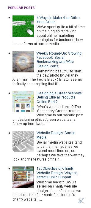
We make tweaks to our blog all the time; and Blogger brings out new features regularly, such as the gadget to add your most popular posts, which we are currently trying out.
Best of all, if you've added something but it doesn't seem to be working as well as it might, you can keep it in but change its position - the layout view allows you to move the blocks of features around.
Tip 3: Simplify your Blog
As we mentioned in our social media website design series, simplicity can ease engagement, and a decluttered look can help visitors navigate your site.
The same is true for a blog - it can be easy to add lots of bells and whistles, but if you make it too cluttered, it will be harder to find the key things you want users to engage with.
We shall be looking at business blogs we like the design of in an upcoming post, but it's defintiely a good idea to see what's out there in your own field and see what you like, what you think works.
Can you use any of the Blogger gadgets to ease usability?
We have one recommendation for an addition which should optimise navigation and therefore visitor engagement: a gadget called 'Linkwithin', which adds three related posts to the bottom of every post you publish.
If you're using your tags effectively, this will give the visitor three more relevant posts to complement the one they've just read.
It works well to generate click throughs on our blog site, and is the ninth best referring site for traffic (accounting for a similar volume of traffic to Facebook and Twitter).
What do you think?
In our next post, we will be looking at design and customisation, and offering some tips of our own.
Let us know if there is anything you want us to cover!
In the meantime, feel free to share a link to your blog in the comments below, and we might feature it on the blog!
